Directed & Edited: Brandon Nelson, Film: Kevin Johnson
Promotional video launching the project. Released in 2015 after filming in Los Angeles
Directed & Edited: Brandon Nelson, Film: Thurz
A After having a good amount of success at Red Bull and Red Bull Records, I decided to branch out on my own and take on the music industry in a new way. I had the idea for a platform where artists could get investments the same way that startups do. I noticed that many artists were using sites like kickstarter to fund their projects, but were not really able to sustain themselves using it. Artists usually had a lot of fans they could leverage, but couldn’t tap into their potential.
Current design of PerDiem website www.investperdiem.com
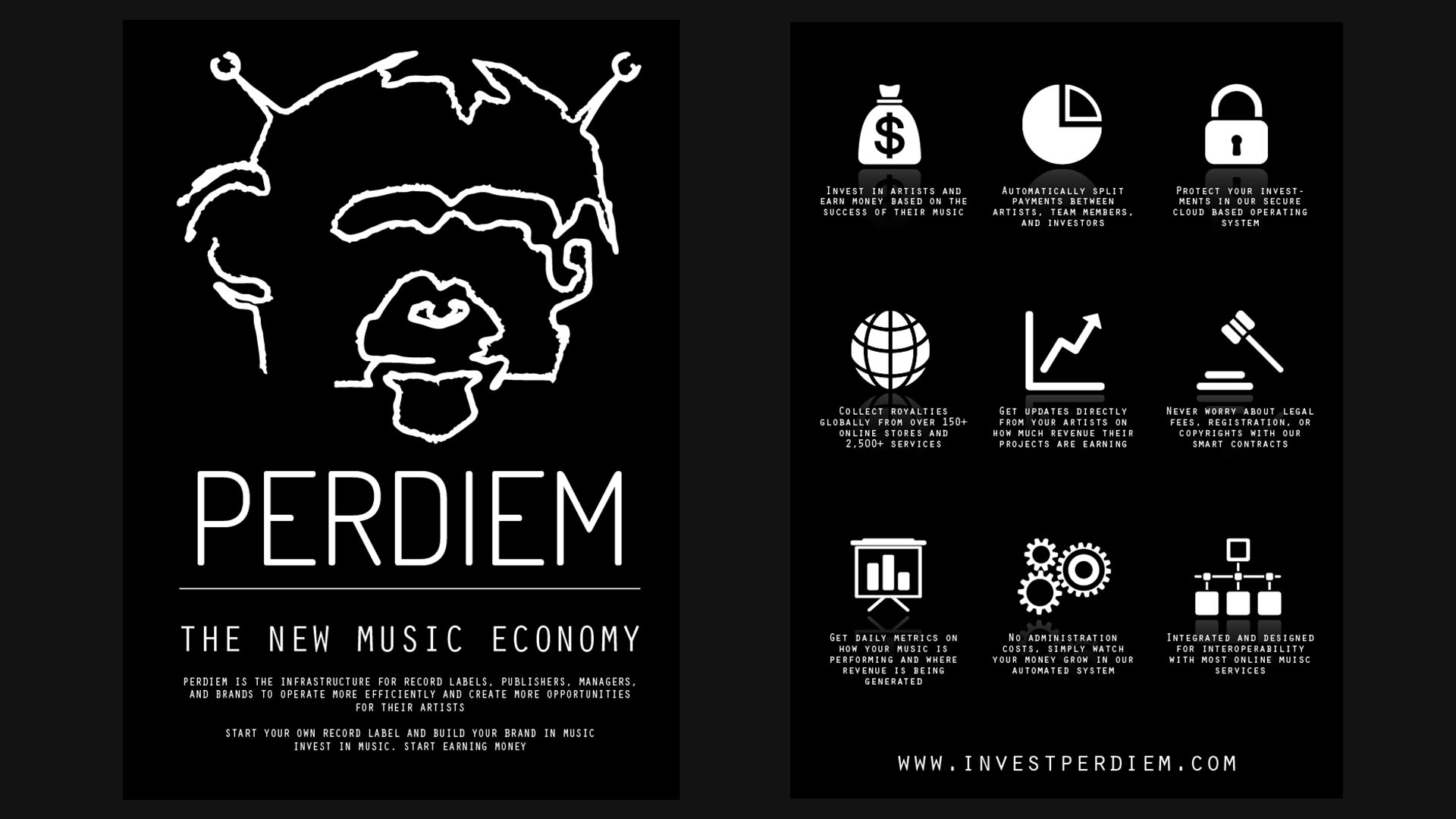
Second round of UX and UI designs
I began throwing around the idea to some friends in the industry, then one of them said he had some artists he would be down to test it out. I was living in Mountain View at the time and a friend at Google heard about what I was working on. He wanted to help build out the backend for it. I agreed and we started getting to work. However, before he could actually start coding he had to get it cleared by Google to make sure there was no conflict of interest. A few days later I got a call from him. He said, “I’ve got good new and bad new. Bad news is I can’t work on this anymore, Google denied my request which I’ve never heard of them doing before, Good news is I think you’ve got something huge”.
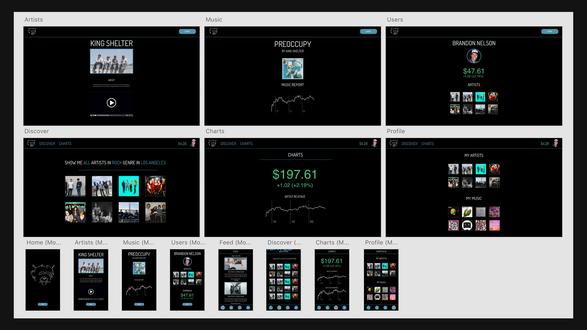
Second round of UX and UI designs for Mobile
I was stoked for the good news, but bummed to hear he couldn’t work on it anymore. I decided I would throw together a simple site that could just do basic functionality. A lot of it would be manual, but all I needed to do was be able to accept payments and track transactions. I spent most of my days at Blue Bottle in Palo Alto designing mockups for how it would work. Eventually, I was able to throw together a basic functioning site that actually looked descent.
I packed up my stuff and headed to LA to meet with my friend and his artists. While there, we filmed a promotional video that helped explain the concept. The video turned out great and we were ready to launch.
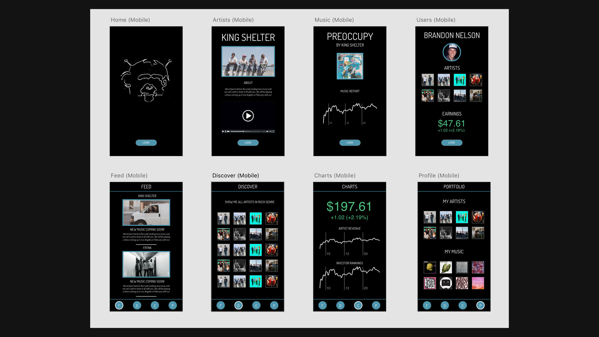
Designs for scaling for all devices
I planned to launch in Sept 2015, then right at the last minute we had to fly to Atlanta to film another piece for one of our Artists. While one the flight back to LA I published the site and posted it on my socials. Within minutes we started getting investments from all kinds of people. Mostly my friends and friends of the artists, but the site was working and people were using it.
Over the next few months we started getting hit up by artists, labels, and other music industry folks. The most exciting was SXSW. They invited us out to be showcased and it would be the first time I the platform would be pushed outside of my network. That spring I packed my stuff and headed to Austin.
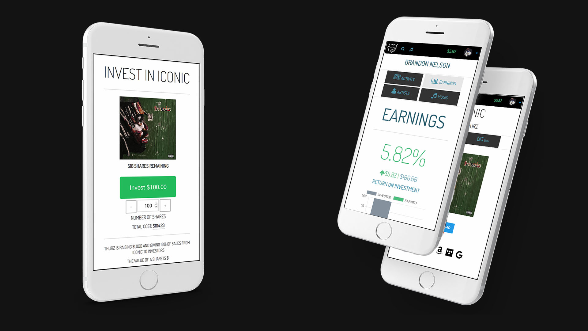
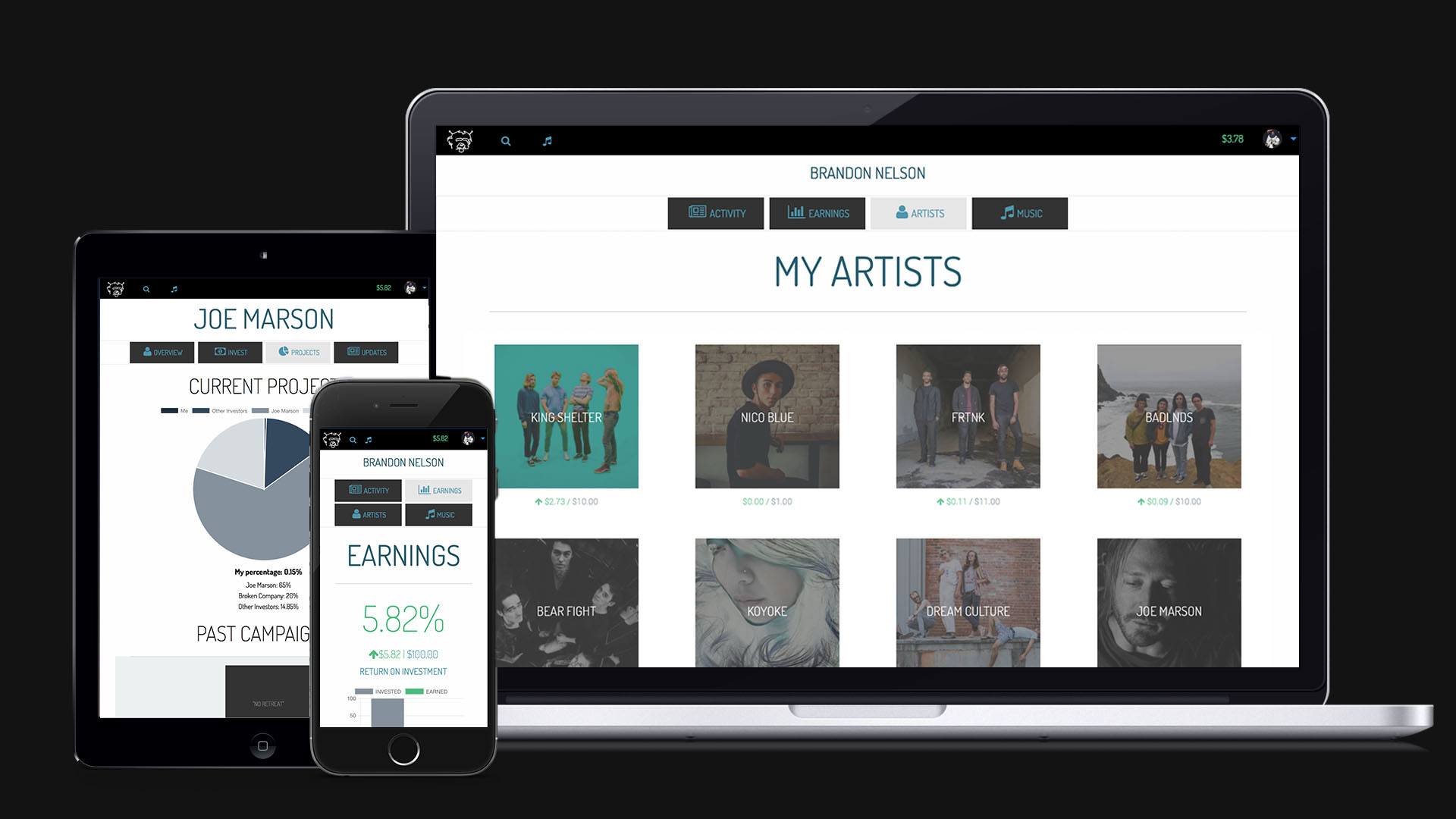
Mobile design mockups
I spoke with hundreds of people about the platform and started getting amazing feedback. Investors were interested and the media began to take notice. I mistakenly ate nachos for breakfast one morning and almost threw up during an interview with a guy from Forbes. After an amazing week in Austin, I get a call from my friend at Google. He said, “I just wanted to let you know I resigned from Google and want to start building out PerDiem.” I was stoked. Things couldn’t be going any better. While still in Texas we actually started coding the new site. I would be in charge of Front End and he would write the Back End. I had already done most of the UX so we just needed to make some minor adjustments to the database schemas and some framework stuff.
Logo design concepts and color schemes
Thing were rolling. I spent most of my day’s deep in Sublime learning every keyboard shortcut that existed. Since there wasn’t any other platform to base ours on, I had to build the entire site from scratch. Even something as simple as a navigation bar took hours to perfect. I learned more about design from trying to optimize pages for mobile that I could have ever imagined. Not only did I have to plan for an infinite amount of screen sizes, I also had to account for the different browser interpretations. That stuff was insanely difficult. I would always get a friend sending me a screenshot of his Windows Mobile phone using IE 4 or something crazy where a graphic overlapped or interpreted wrong. It was a ton of work trying to keep everyone happy.
I launched the new site with an entirely different look. Everything I had done in the past was cool, sexy, and mysterious. I was finding a lot of success in this design style. I loved the site, and so did all of my friends. I was confused to why it wasn’t gaining as much traction as I thought it would have. I soon learned that people don’t like putting their credit cards into dark underground looking websites. It was back to the drawing board. The months of work that I put into that design were out the window, but I had learned a lot and was getting much better at this stuff.
I dove super deep into UI and design principles. I spent forever researching tiniest components in design. The psychology of how people viewed colors and buttons. What type of corners caused people to click on things more. How could you guide someone through a site without explicitly telling them what to do. It was a lot of fun to learn, and even more fun to test out.
Alternative logo design concepts
I changed our buttons to rounded corners. There is a specific amount of rounds that people find appealing. People don’t like sharp corners. It signifies danger in the real world. That is why most buildings have round them out. It creates a certain emotion that makes people feel safe. Color was also a huge factor. The types of color for certain text would signify important information, links, or things related to money. It was essential to keep these consistent. I found that re-designing the UI made a huge improvement in helping people understand the site better. One day, one of my silicon valley friends showed me a site that absolutely blew my mind. It was a site where you could watch people visit your site in real-time. I was the most insane thing I had ever seen. I realized that many people were actually having a lot more trouble with the site than I realized. I didn’t spend too much time working on improving the UX as it seemed everything was working fine. Once I started seeing how people browsed through the site, my perspective changed. I noticed things that were very different than traditional analytics. Instead of seeing how people flowed through the site, I could see WHY they flowed through the site. I could see exactly where they were hovering their mouse, how far down on the page they were, and where they lost interest. This information was golden.
Promotional designs for SXSW
I scratched the last design and rebuilt it from the ground up, taking into account the new information that I had. It needed to be more clean and comforting. Too much innovation was not a good thing. It needed to be familiar and functional. Many of the new visitors were artists looking for investment, rather than investors looking to invest. So I moved the artist application from the contact page to the main page, and moved the sign up to the bottom of the landing page as well. Immediately I noticed a drastic increase in our applications. We went from getting an application once a week to once a day. Over a 700% increase. Our sign ups increased dramatically as well. We started receiving more investments from outside of our network. People seemed to be more comfortable entering their credit card into the site. It was amazing to see these design concepts actually working.
Today PerDiem is known in the industry as pioneering the first investment platform for music and we have been invited to several conferences around the world to speak about the platform and its development.
After an incredible journey bringing this project to life, I decided to step away from it full time and focus on new efforts. I was made an offer for the site, but since I felt that it was not mine to sell, I decided to step away from it. I reached out to every artist and investor and cashed out all earnings and sent to everyone, any funds not claimed were returned to the artists. In the end, I gave all of the funds earned on the platform back to the artists.
The biggest takeaway from this, was that it was too early on. There was no proven system and people and artists had a hard time understanding the concept. For me, it was straightforward, but for the artists, they struggled to calculate the "break even" for an investment.